Flaw(ed) Academy

It’s been a while since I signed myself for an online course – the last one being many years ago when I had plenty of free time in one of my jobs. But a couple of weeks ago, an Instagram ad caught my eye – it was a free Creative Writing course from Shaw Academy. Since I’m always looking for help to improve my writing, I decided to give it a shot. I clicked on the ad, followed the instructions, and signed up.

First hiccup – there was no Creative Writing course for me to choose from. It had automatically signed me up for some Social Media course which I had no interest in. Puzzled, I tried digging around the website to no avail. Seemed like I was stuck. I decided to ignore it and move on with my life.

Last week the ad popped up on my feed again, and in the comments someone left their email address to get in touch with for support. I decided I would give it another shot, so I reached out to them and wrote about my issue. Support was quick to respond, to my surprise, and they added the Creative Writing course to my account. Sweet. I logged in and scheduled my first set of classes.

The next day, it was time for my lesson, I was late by a few minutes when I logged in, so the video was already playing. Imagine my surprise when I discovered there was no rewind or pause button. Strange, I thought. Regardless, I continued watching the video until the end, where the instructor mentioned that these lessons would be rewatchable from the Course Toolkit.

So, off I went in search of the Toolkit – turns out it was something I had to pay to access. The only other way for me to watch the portion of the lesson I missed is to reschedule the lesson to another day. The assignments for the course are also part of this toolkit, looks like I won’t be submitting anything for this course.

I understand that having this strict schedule might be an attempt to discipline students into following deadlines/schedules – I get it, but this is not a real school. It’s not even a live stream broadcast where a student coming in late could disrupt the session. Just give us playback controls! Isn’t that the point of technology? Isn’t it the point of online courses? They’re meant to be flexible so people with busy days can learn whenever they have the time.

And why call it a free course when students can’t complete it without paying any money? I might sound like some spoilt brat but I’m comparing this to edX – an online school that is actually free (with the option to spend money for a physical certificate if that matters to you).

I’ve completed eight courses on edX over the past few years, and I can tell you it does everything right that Shaw Academy doesn’t. Videos can be controlled, and you can watch them at any time. No need to spend any money to access lesson materials, or bother trying to squeeze it into your schedule – it’s all available when you have the time. There’s human interaction if you’re interested (most courses will have a forum for discussion and to comment on each other’s work).

Shaw Academy, thanks for the free trial, but I won’t be continuing with my course even though the lesson videos were informative. Unless some drastic changes are made to the whole learning experience, I can’t imagine anybody paying for this. Especially when there are much better and free alternatives out there.

UT47.2 Review

UT47.2 with clear low profile case

When Keyhive announced the UT47.2, I was immediately interested: a hotswap staggered 40% keyboard kit for $38 (group buy price – excluding shipping, switches, keycaps and case) – what more could you ask for?

Clear 3D printed plate and case

I purchased the optional 3D printed low-profile case since I wanted more protection for the PCB than the default kit provided, and I’m more than happy with it. Despite the case and plate being 3D printed, I had no issues inserting switches into the plate, which lined up with the PCB and case perfectly. Assembly was a breeze.

NovelKeys Kailh Box Pink switches

Kailh Box Pink were my switches of choice and after using them for a day, it’s safe to say I’m in love. Box Pink is my new favorite clicky switch. It makes me wonder why nobody is talking about them? They feel like a slightly heavier Box White switch with a much deeper click – similar to how a Box Navy sounds, but softer! I’m definitely picking up more of these for future clicky builds. If what I’ve said sounds like what you’re looking for, give them a shot. You won’t regret it. Great job, NovelKeys!

DSA Granite

After testing out the switches, the next step was putting the keycaps on – which took more time than putting the board together, I kid you not. Major props to Keyhive for the wonderful experience. Keycaps are DSA Granite, which was what I had on my (sold) Vortex Core. They couldn’t have asked for a better new home.

Important!

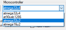
Flashing the keyboard was straightforward – just remember to set your QMK Toolbox configurator microcontroller to atmega32u2 (something I missed initially), and you’re good to go. I’ve been using 40% boards for a while now so I already knew what layout I wanted on it – there was no need to experiment. For this keyboard, I used a combination of my Planck and Kumo (Minivan) layout. If you’re interested, you can preview it or download the .hex and .json here.

While there is a lot to praise about the UT47.2 – I do have some minor complaints (none were deal-breakers for me, but I thought I’d point out). Firstly, it uses a 1.25u (enter) key on the home row. This isn’t an issue if you’re using flat profile keycaps like DSA, but on sculpted profiles (i.e. Cherry), it’s going to be difficult finding keys for it in the right profile (almost impossible if you want the correct legends). A handful of upcoming keysets will be addressing the need for this extra key. But if you plan to use an existing sculpted keyset with this board, you’re going to have mismatching profiles for that 1.25u key since most 40s kits in the past only have one of those (usually with the Tab legend).

Bought my own rubber bumpons

The kit didn’t come with stabilizers for the 2u space (unnecessary, but supported by the PCB and plate), rubber bumpons (also unnecessary, but something I appreciate) or a USB-C cable. Those are my only complaints.

If you’re interested in picking up one for yourself and missed the group buy, fret not. Keyhive has some extras for sale here ($50) and you can purchase the optional case here ($25) – Keyhive has tons of different designs. SpaceCat also has the UT47.2 on sale here.

Typing Test – quality isn’t that great since it was recorded on my phone, but it should give you an idea of what to expect.

Conclusion: the UT47.2 is one of the best staggered 40% keyboards I currently own. If you’re thinking of trying out the form factor, on a budget and not looking to solder – this keyboard is right up your alley!

This post was written on my UT47.2

1UP Keyboards HHKB (kit) Review

1Up Keyboards HHKB Kit

After using the Tokyo 60 and Tofu for a few months, I realized that they’re not as portable as I’d like them to be. Even though they’re not heavy like a full-sized keyboard, you start to feel the difference in your backpack – I could tell whether I had one of them inside by the weight of my bag alone. While I have a regular HHKB, its lack of customization (without a Hasu controller) annoys me sometimes, especially because I love using mouse keys when working on my laptop.

I’ve been keeping my eye out for a lightweight HHKB custom keyboard, and when 1Up Keyboard’s Hotswap HHKB Kit flew into my radar, I knew it was what I wanted. Here’s what I ordered: clear plastic case, carbon fiber plate, hotswap Tsangan PCB, and stabilizers. I got my switches and keycaps elsewhere.

Side profile

Firstly, I want to shout out about the purchasing experience on the 1Up Keyboards site. It’s been the best purchasing experience I’ve ever had on any keyboard shopping website. It was so easy to make sure I got everything I needed for the keyboard. There are easy-to-use drop down menus to select what you want, with prices listed clearly and total price updating live. All the options are selectable on a single page, and they make sure you can only choose compatible parts. Even though I didn’t need it, I can see how easy it would be to recommend to people who are building their first keyboard.

Back to the keyboard. It arrived undamaged, in no frills packaging that was sufficient to keep it protected. No complaints there, I also received a whole bunch of stickers to use. I assembled the board with no issues. I have never used a carbon fiber plate prior to this, so I expected it to be extremely flimsy – I was so wrong. Switches snapped in nice and snug. It worked just like a normal plate that was very light.

I put on Box Navy switches with Maxkey SA keycaps on this and was surprised to feel that it was even lighter than my HHKB (I don’t have a scale that’s accurate enough to measure the difference – my test was holding one keyboard in each hand, so I could be wrong). I was very impressed by how light it is. I suspect it would be even lighter with different (shorter) profile keycaps on. Regardless, it met my requirements of a lightweight, programmable MX-style HHKB.

Exposed carbon fiber plate

First thing I noticed about the typing experience was the flex. While it didn’t feel like I was bending the PCB, my keystrokes felt more cushioned compared to typing on a metal plate. Then again, it could have been the effect of a tray mount vs. integrated plate (which the Tokyo60 and Tofu HHKB use). I would probably need to use more plates and mounting styles to come to a conclusion. In my opinion, the switches and keycaps that you use will probably have a more noticeable effect than the type of plate but this is coming from someone who’s relatively new to the hobby. More experienced people would probably tell you otherwise. As to whether this feels better or worse – I’m indifferent. Flex vs no flex is a personal preference, and I don’t have a preference for either.

Typing on SA keycaps on Box Navy is a pretty enjoyable experience. The thick clicks are definitely amplified and people know when you’re hard at work, or gaming. I’ll be trying out different switches in the future (the positives of having a hotswap board) to see if they work better with the flexible plate.

The underglow is BRIGHT

The underglow lights on this thing is bright – especially when paired with a clear case, you can easily illuminate the surface around the keyboard. Fortunately, you can easily disable them if you find it distracting (I only turn on the underglow for photographs as I rarely use it when I’m working). You get the standard RGB modes and colors you can access through QMK, nothing out of the ordinary here.

Programming the PCB was easy – just like any other QMK PCB. However, I’ve been seeing an issue with the board pop up a couple of times on the 1Up Keyboards Discord: my PCB arrived unflashed. This meant, I couldn’t input any keystrokes on the keyboard when it was first assembled. I had to use the physical reset button (fn+b wasn’t working for me) to get it into bootloader mode before flashing my keymap. This isn’t a big deal for most people, but some sort of default layout would have been helpful for those who decide to screw the board into their case before flashing it (you can’t access the reset button without removing the PCB from the case). I’m not sure if it’s an issue for all of the PCBs they sell, or me and the people who complained were only the minority.

Issues: I won’t lie – the silver carbon fiber plate is hideous. I should have gone with black or red, though I can’t expect it will look much better. I’m not sure if it’s possible, but a texture-less version of the carbon fiber plate would have been more up my alley. This is my biggest problem with the keyboard. Yes, you read that right. I love everything else about it.

So was the board everything I wanted? Yes. I set out to build a lightweight keyboard and I got exactly that. And to top it off, it’s affordable (your choice of switches or keycaps will affect the base price). It’s also an in-stock item that you can purchase any time from 1Up keyboards instead of having to wait for a group buy (unlike the Tokyo60). Oh, it also comes with USB C.

Overall, I am extremely pleased with the 1Up Keyboards HHKB and wouldn’t hesitate to recommend it to anybody looking for an easy to assemble, lightweight and affordable keyboard. It is also available in other styles (standard ANSI and Win key-less) if HHKB isn’t what you’re looking for.

Here’s a sound test of the 1Up Keyboards HHKB: