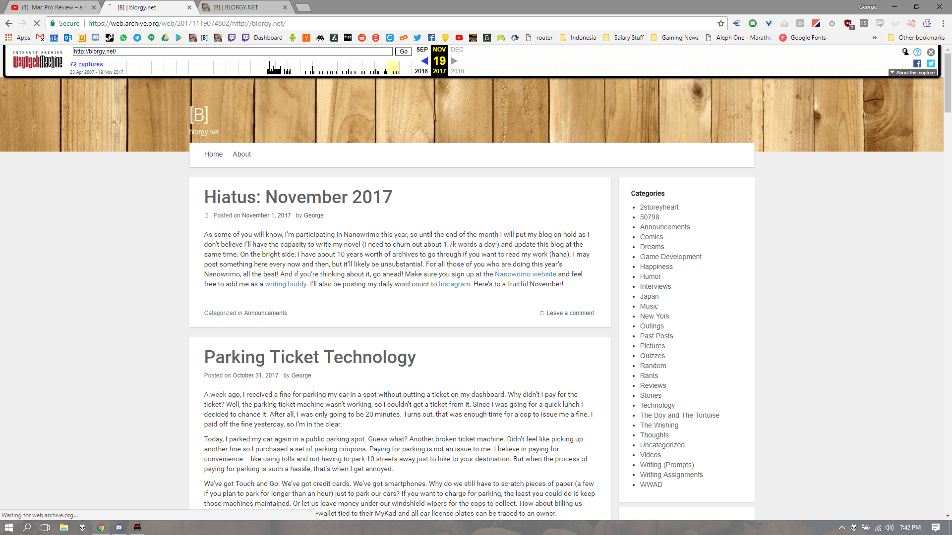
Some of you might have noticed that my blog has a new look now (it’s only obvious if you’re browsing on your desktop). Since I launched blorgy.net way back in 2007, I’ve only been through two revisions. The other day I was just thinking about changing up my site a bit since I had some funky keycaps which I could use to recreate my original logo and I just continued working on the site from there.

blorgy.net 1.0
I compressed the archives and categories section in the sidebar since I don’t think people use them too much, and they were getting a little too long for my liking (I can’t believe I’ve actually managed to keep this blog running for over ten years!). I added some social media buttons, removed dead links, and reduced the number of posts on the front page. I also added ‘related posts’ at the bottom of each post since I’ve got a wealth of posts to link to now (I’ve written over 700 posts to date). Hopefully it doesn’t link too many cringey posts.

blorgy.net 2.0
Overall, they aren’t huge changes, but I think the site looks a lot better now. Also, the color scheme is based on the Vortex Core keyboard (the keys in the logo are from the keyboard). I’m a big fan of its retro color scheme. The font used is Bryant Regular, which is similar to Gorton Modified (couldn’t find the font for that) – the font used on the legends of SA keycaps. Not sure if I managed to change all the elements of my site properly, but based on my initial checking, it seems fine. Let me know if I missed anything.
Prior to this, I hadn’t touched CSS or HTML in a long time. I had to do tons of Googling for simple things like changing the background color. It’s crazy how much I didn’t know or remember! Anyway, it was a fun experience and I’ll probably make additional tweaks over the coming weeks if I think of anything else.

Leave a Reply